MAGAZINE
RESEARCH

|
We can see that the main focus is on the main character of the exorcist movie which is a figure that has become familiar with the majority of society of being connected to this movie showing the success in this marketing technique. PARACINEMA magazines tend to be quite simplisitic alike to this one with just the title picture and a couple of headlines. This draws most of the attention to the actual picture making it stand out and become more memorable from one glance.
As a group we can see ourselves similarly using this technique where we make one particular thing in our magazine stand out the most and correlate it to our other products. The text for the title is quite edgy and abnormal adding an eerie feel to the magazine further building up the horror pretext. The colour yellow itself is quite bright which would attract people to look at this magazine as it would stand out. This gives us the idea to use brighter colours within our poster to also create this initial attraction for an audience to view our magazine. |
|
Similarly to 'PARACINEMA' , 'SCREAM' also uses a variety of bright colours in its title and other texts drawing the audience to look at this magazine which presents the popularity in this technique.
Scream magazines tend to have a side bar in which they add previews of stories and articles within the product. Each of the previews are supported by a picture, usually of the villain of each of the supporting movies. This makes each of the articles within intriguing. As a group we think this a better technique of laying out the magazine as it shows a variety of different headlines in a more visually appealing manner drawing an audience to want to read into the product. Furthermore we liked the idea of having a bar at the bottom of the magazine with 'plus' information as it makes the audience want to buy the issue as they could be gaining more value out of their money. There is also a very distinct colour scheme with the colour of the supporting texts correlating with the title of the movie aswell as the scenery in the background, something we can see as a group to incorporate in our magazine. |

|

|
EMPIRE magazine popularly tends to cover the action genre. Their colour scheme emerges from the characters costume on the front cover. In this case The Joker is sat on a bench with a sinister stare with his most famous costume of being smartly dressed in the colours of green and purple. These colours correlate widely with other text components of the magazine. Alongside personalising this cover, for one film like at the top saying 'The Dark Knight Exclusive!' with the Batman symbol, to grab our attention. Additionally Empire uses 3D effect techniques to make the character on the cover stand out. This grabbed our attention as creating this effect constructs the magazine to look creepy which makes it more appealing to customers since we feel curious to read its contents. Empire are another magazine company that have a 'plus' section at the bottom because it makes the audience want to buy the issue as they could be gaining more value out of their money like Scream. However here you can see they have just listen other big Hollywood films and famous people to get other fans to also read this magazine.
|
FANGORIA
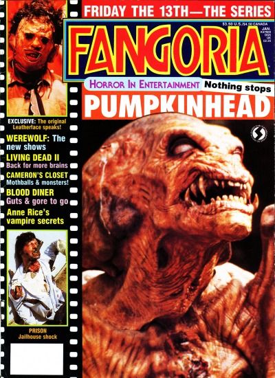
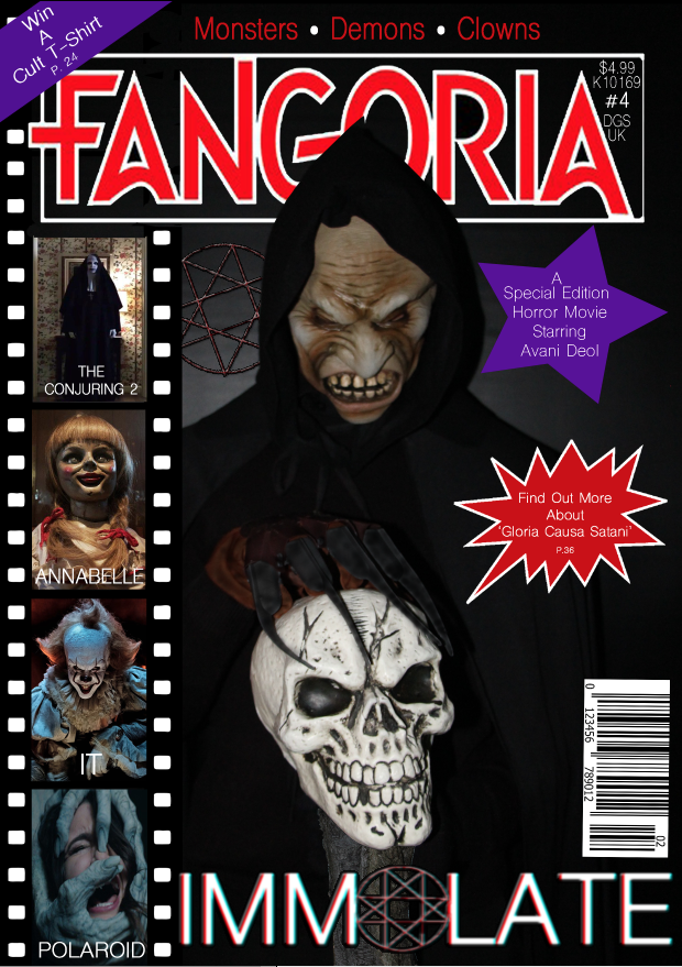
After thorough research we came across an internationally distributed american film fan magazine called FANGORIA who have made covers for various films such as; The Shining, The Descent, The Hills Have Eyes, Hannibal an Hellraiser. They usually make magazine covers for traditional horror films. One feature that we really liked from this magazine were the film strips on the side of the cover where it displays a few different villains from different horror movies. This attracts the fans of those films since they assume this new movie will be similar to those films, in which most cases is the truth. Another feature of this magazine that we liked was the little note on the corner telling the audience they have a chance to win a t-shirt through this magazine. This provides another incentive for consumers to buy the magazine and therefore helps promote the film. Here are a few example of products we were inspired from:

|
|
OUR FINAL MAGAZINE PRODUCT
POSTER
For inspiration we looked at posters based on our genre and looked at how the portrayed their product through the use of their posters. We also looked at things that would inspire us with our poster. The overall idea was that the main victim was portrayed in the poster however the main villain wasn't shown in some but there were some that showed the villain. The posters that inspired us however had both the main villain and victim.
|
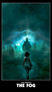
This poster is from the movie called The Fog. It inspired us in many ways when creating our poster. For example, we implemented the fog into our poster as this would show that there are loads of mysteries throughout our trailer and story line.
We also used the concept of having the villain and the victim in the poster and also having the victim at the front of the poster and have the villain at the back. Some of the colour scheme was used in our poster for example the use of black and white to make the poster seem dark, mysterious and give it an eerie affect. The use of low key lighting was also implemented within our poster to show that our trailer is dark and that it matches our genre. |
|
|
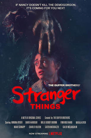
This poster is from Stranger Things and this also helped to inspire us when creating our own poster. For example, the worried face on the the main characters face, the use of the claw near the main victim face and the main villain being behind the main victim.
The use of having the victim against something, we had the victim in front of a tree that was in our forest. The use of the colour scheme was also used in our poster as they had used red for danger, black for mystery and darkness and then also the use of white for creating a supernatural effect. The poster also had some slogans has well. We also used slogans from our film trailer implemented within our poster. This poster also uses low key lighting to show that the genre is horror and that the story line is dark and is about someone or something that is evil. |
|
|
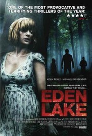
This poster from the film Eden Lake also inspired us when creating our poster. For example, we had the mother lean on a tree from the forest location for our poster. We also had her make a worried and alert facial expression while looking behind her as the villain will be behind her. This poster also has the villain at the back but it has the silhouette of them however we showed the mask of our villain. We also had a similar colour scheme as this poster as they had also used black, white and red. The poster also has a fog at the background behind the villain which inspired us to put it in our poster but had more red so it represented blood. The poster has a low key lighting so it has a dark and eerie effect which we had also done for our poster. Below is also the companies that helped with the creation of the film. We had also added slogans from our film to our poster just like this poster.
|
|
OUR FINAL POSTER PRODUCT

